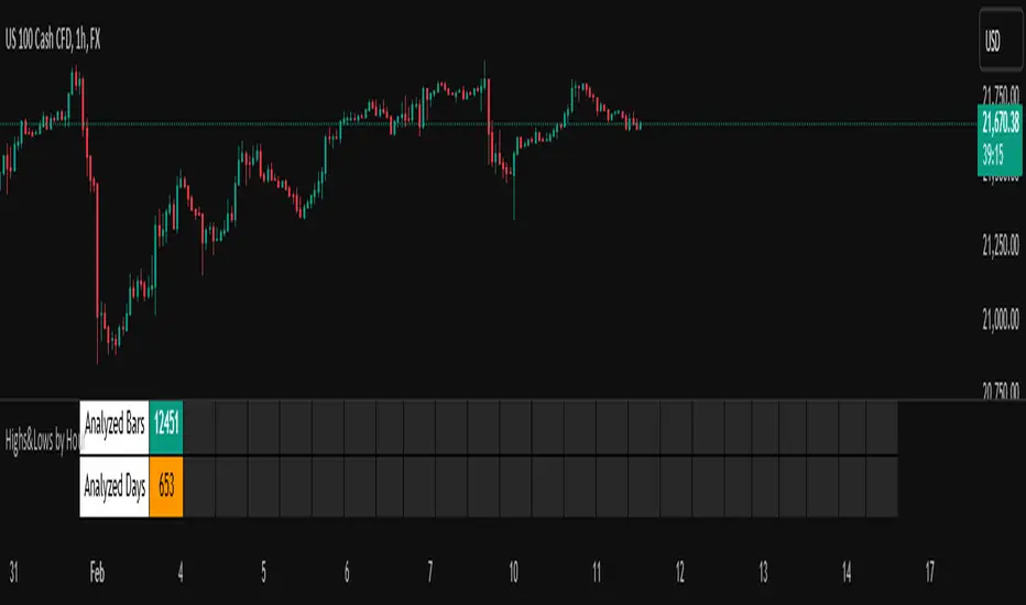
Highs&Lows by HourHighs & Lows by Hour
Description:
Highs & Lows by Hour is a TradingView indicator that helps traders identify the most frequent hours at which daily high and low price points occur. By analyzing historical price data directly from the TradingView chart, this tool provides valuable insights into market timing, allowing traders to optimize their strategies around key price movements.
This indicator is specifically designed for the one-hour (H1) timeframe . It does not display any data on other timeframes , as it relies on analyzing daily highs and lows within hourly periods.
This indicator processes the available data based on the number of historical bars loaded in the TradingView chart. The number of analyzed bars depends on the TradingView subscription plan , which determines how much historical data is accessible.
Key Features:
Works exclusively on the H1 timeframe , ensuring accurate analysis of daily highs and lows
Hourly highs and lows analysis to identify the most frequent hours when the market reaches its daily high and low
Sorted by frequency, displaying the most significant trading hours in descending order based on their recurrence
Customizable table and colors to fit the chart theme and trading style
Useful for scalpers, day traders, and swing traders to anticipate potential price reversals and breakouts
How It Works:
The indicator scans historical price data directly from the TradingView chart to detect the hour at which daily highs and daily lows occur.
It counts the frequency of highs and lows for each hour of the trading day based on the number of available bars in the TradingView chart.
The recorded data is displayed in a structured table, sorted by frequency from highest to lowest.
Users can customize colors to enhance readability and seamlessly integrate the indicator into their analysis.
Why Use This Indicator?
Identify key market patterns by recognizing the most critical hours when price extremes tend to form
Improve timing for trades by aligning entries and exits with high-probability time windows
Enhance market awareness by understanding when market volatility is likely to peak based on historical trends
Important Notes:
This indicator works only on the one-hour (H1) timeframe . It will not display any data on other timeframes
Works well on Forex, stocks, crypto, and futures , especially for intraday traders
The indicator analyzes only the historical bars available on the TradingView chart, which varies depending on the TradingView subscription plan (Free, Pro, Pro+, Premium)
This indicator does not generate buy or sell signals but serves as a data-driven tool for market analysis
How to Use:
Apply the Highs & Lows by Hour indicator to a one-hour (H1) chart on TradingView
Review the table displaying the most frequent hours for daily highs and lows
Adjust colors and settings for better visualization
Use the data to refine trading decisions and align strategy with historical price behavior
Pesquisar nos scripts por "high low"
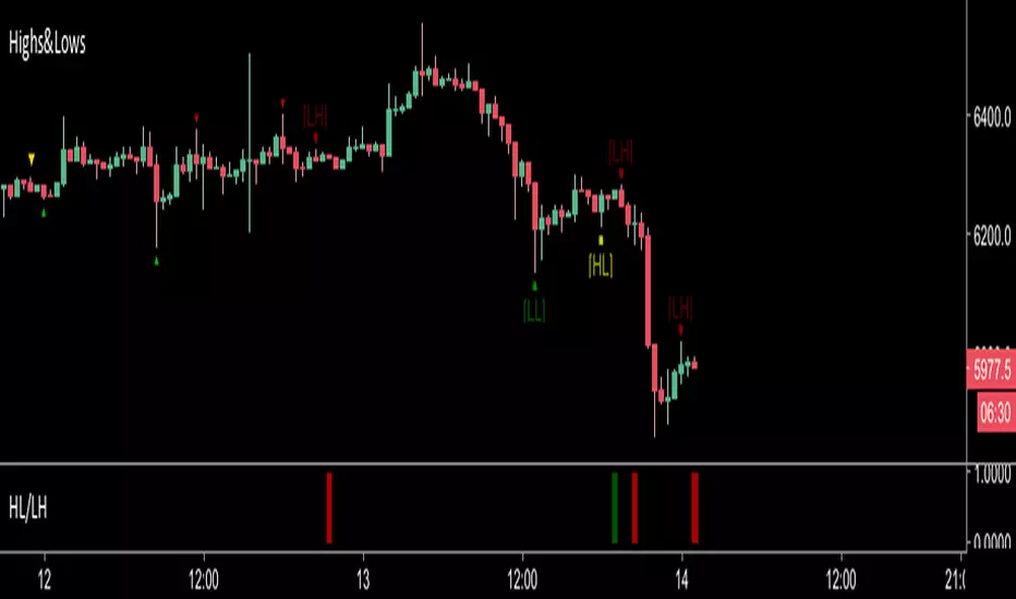
Highs&LowsShows Higher Highs, Higher Lows, Lower Lows & Lower Highs based off of Bill Williams fractals.
I use this mainly by shorting a break of the higher lows marked in yellow.
A long signal would be a candle close above a lower high (less reliable)
Alerts can be set with the secondary indicator below the chart.
Higher Lows / Lower Highs Alerts -https://www.tradingview.com/script/Ka1yXqRj-Higher-Lows-Lower-Highs-Alerts/
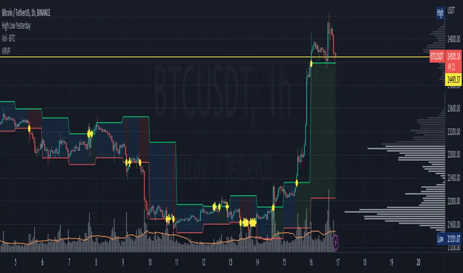
High Low YesterdayMy friends, this is a very simple script, but it has some work to function the way it currently does.
Basically it prints the HIGH and LOW from previous day into the current day. This forms like a channel.
It's useful to visually detect when the price cross over the yesterday's high, or close under yesterday's low.
You can activate/deactivate colors as input parameter:
- Price above a previous high: fills green.
- Price below a previous low: fills red.
- Price inside previous low/high: fills blue.
Hope this helps to you too.
This only works for intraday resolutions only (less than 1D)
More to come: I'm working to include pre-market low/high for the current trading day.
High/Low Fibs using Bullish Anchors I do Love me some fibs!!
i used a lot of 30 min Opening Range Fibs for interday trading, but have found that using more bars back can make for stronger levels just like when we use higher time frame to see support & resistant levels.
You can just find high and lows for making an easy auto draw fib retracment, I think you will find these to be fairly accurate or at least just entertaining .
Here are some basics on how to use FIb Retracments
Fibonacci retracement is a popular technical analysis tool used by traders to identify potential levels of support and resistance in financial markets, including stocks. It is based on the Fibonacci sequence, a series of numbers where each number is the sum of the two preceding ones (e.g., 0, 1, 1, 2, 3, 5, 8, 13, 21, ...). The key Fibonacci retracement levels are 23.6%, 38.2%, 50%, 61.8%, and 78.6%. These levels are used to identify potential reversal points or areas of price consolidation. Here's how to use Fibonacci retracement in stock trading:
1. Identify a Significant Price Move:
Start by identifying a significant price move in the stock you are analyzing. This move can be either an uptrend or a downtrend. For uptrends, you'll be measuring from the low point to the high point, and for downtrends, you'll measure from the high point to the low point.
2. Draw Fibonacci Levels: *With this indicator We do this for you
Once you have identified the price move, use a Fibonacci retracement tool available on most trading platforms to draw the retracement levels. Typically, you will draw lines from the low point to the high point for uptrends and vice versa for downtrends.
3. Analyze Key Levels:
Pay attention to the key Fibonacci retracement levels, especially the most commonly used ones, which are 38.2%, 50%, and 61.8%. These levels are considered significant in determining potential support and resistance areas. The 23.6% and 78.6% levels are also used but are considered secondary.
4. Look for Confluence:
Consider other technical analysis tools and indicators to look for confluence at these Fibonacci retracement levels. For example, if a 50% retracement level coincides with a moving average or a trendline, it may strengthen the level's significance.
5. Monitor Price Action:
Watch how the stock's price reacts when it approaches these Fibonacci retracement levels. If the price stalls, reverses direction, or shows signs of consolidation around a particular level, it may act as support or resistance.
6. Set Entry and Exit Points:
Based on your analysis, you can set entry and exit points for your trades. Traders often look for buying opportunities near Fibonacci support levels and selling opportunities near resistance levels. Stop-loss orders can be placed just below support or above resistance levels to manage risk.
7. Practice Risk Management:
Always use proper risk management techniques in your trading. This includes setting stop-loss orders, determining your position size, and not risking more than you can afford to lose on a single trade.
8. Monitor Market Conditions:
Be aware that Fibonacci retracement levels are not foolproof and should be used in conjunction with other analysis methods and market conditions. Market sentiment, news events, and economic factors can also influence stock prices.
9. Continuously Learn and Adapt:
As with any trading strategy, it's essential to continuously learn and adapt. Test the effectiveness of Fibonacci retracement levels on different time frames and with different stocks to refine your trading strategy.
** Special Thanks to @KioseffTrading for doing most all of the HEAVY LIFTING on the code here... he is beyond a Top G!!
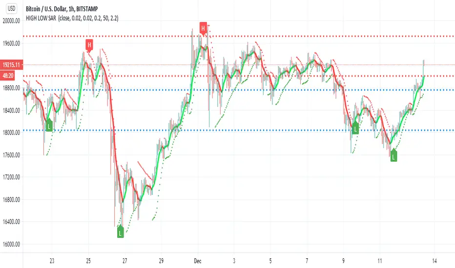
HIGH LOW SAR This script i try to detect high and low using SAR
the red and blue lines represent present and past support and resistance level
the trend line in lime and red is Hull
sar signals of high and low are done by cross of SAR and bollinger channel upper and lower and condition that it either below or above the resistance and support levels
there are alerts but i think as a bot it not so good , better to use this one as idea for possible high and low where the targets are shown by resistance and support level
this is just idea how to make the SAR to show us high and low , maybe with more refinement it would be better
High/Low Weekly TimeframeI'm testing a simple but useful indicator that plots the high and low for the current week. The time-frame can be selected by the user.
It's useful when you're trading in a smaller time-frame (example: 1H or 4H) to know exactly the weekly low and high, and whether the price breaks above or below this price lines.
This indicator allows you:
- To select the desired time-frame to get the Low and High.
- To print an optional EMA for the same time-frame.
- To optionally change the bar-color when the close price crosses above the weekly high or crosses below the weekly low.
Hope this helps you to visually identify price movements.
If you like this script please give me a like and comment below.
Thanks,
Rodrigo
High/Low from Set Period with LabelsMark high and low from a set period.
I use it to mark Overnight Low and High of FDAX instrument, to achieve that :
- you need to use candle chart
- you need to use regular trading hours ( to include overnight trades )
- you need to set that on M2 timeframe
- you need to set time begin : 17:30
- you need to set time end : 08:58
- when it will be drawn in 09:02, then let extend it via a hand and then you can disable
Issues :
- it will be visible after finished miminum period time :
-- after 2 minutes on M2 ( 9:02 )
-- after 5 minutes on M5 ( 9:05 )
etc ...

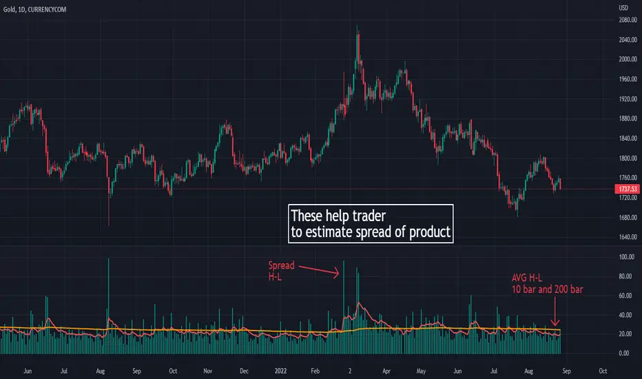
High low volatile
its purpose to make this script is learning how many spread on each product.
its help trader and me to estimate spread of High and low for make a better trade
Money management :
Its also useful to help trader to manage number of lot to take a risk on that trade
How it work?
I use High and low to calculate the different between on them
and I add an EMA 10 and EMA 200 to estimate spread of each product in many bar
On second picture , I use it on GOLD 1H timeframe . You can see that Gold in hour trade on my country time (thailand) It has more spread on 19.00-23.00 pm (in US time is 7.00-11.00)
It help trader to set time when to trade and when to leave
thank you
High/Low stopFirst of all let me quote some important points :
• You need stops; a trade without a stop is a gamble.
• You need to know where you’ll put your stop before you enter
a trade.
• Everybody needs hard stops.
• Whenever you change a stop, you may move it only in the direc-
tion of the trade.
There is a variety of techniques available to traders who like to use
trailing stops:
• You can use a multibar low as a trailing stop; for example, you
can keep moving your stop to the lowest low of the last three
bars (but never against your trade).
• You can trail prices with a very short moving average and use its
level for a trailing stop.
• You can use a Chandelier stop—every time the market makes a
new high, move the stop within a certain distance from the top—
either a specific price range or a number based on an ATR (aver-
age true range). Any time your stock makes a new high, you place
your stop within that distance from the top, like hanging a chan-
delier (this method is described in Come into My Trading Room).
• You can use a Parabolic stop .
• You can use a SafeZone stop .
• You can use a Volatility-Drop stop (described below, for the first
time in trading literature).
• You can use a Time Stop to get out of your trade if it does not
move within a certain time. For example, if you enter a day-trade
and the stock does not move within 10 or 15 minutes, it is clearly
not doing what you expected and it is best to scratch that trade.
If you put on a swing trade which you expect to last several
days, but then a week goes by and the stock is still flat, it is
clearly not confirming your analysis and the safest action would
be to get out.
This is a summary taken from Dr Elder book and this indicator i coded from one of his book where he briefly mention this trailing stop technique but don't dive a lot into it, but still i found to be very effective.
You can use even the short stop (the green dots) as an entry point.

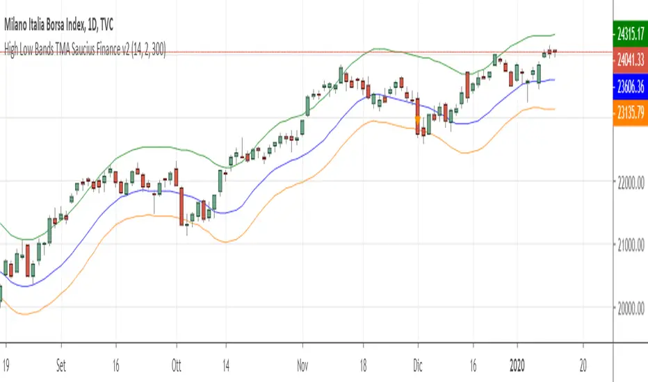
High Low Bands Triangular Moving Avg Saucius Finance v2Bands based upon triangular bands are more precise and quicker than those which use Bollinger’s method (simple moving average), Keltner’s one, Highs and lows and so on.
Just enter long when prices cross over “middleband” and go short viceversa. As filter the color of the signal’ candle must be coeherent with your next position (price shall go down if you want to go short and viceversa).
Upper and lower bands are the target: close the position when price undergo the upper band (or High band) in case of long and when price overcome the lower one (Low band) in case of short. Frequently price have a retracement towards middleband: for being safe, open another long position again (after the previous one) if the close is higher than the upper band (lower than the lower band in case of short).
K is only a factor to determine the distance of the middleband to the lower one (since Big stock markets tends always to grow, short is less interesting).
You can use my indicator in all temporal frame for many (not all!) financial instruments.
I recommend in particular to use Heiken-Ashi figure (but you can use the standard one). For a quick (but not hysteric) trading, use graph 30′ to open position, and wait the next bar for a confirm. As second filter, simply open position coerehent with the daily graph (I meanif in daily desk signal is long, do not open short position in the 30 minutes’ one).
Contact me for any explanation and watch my site!

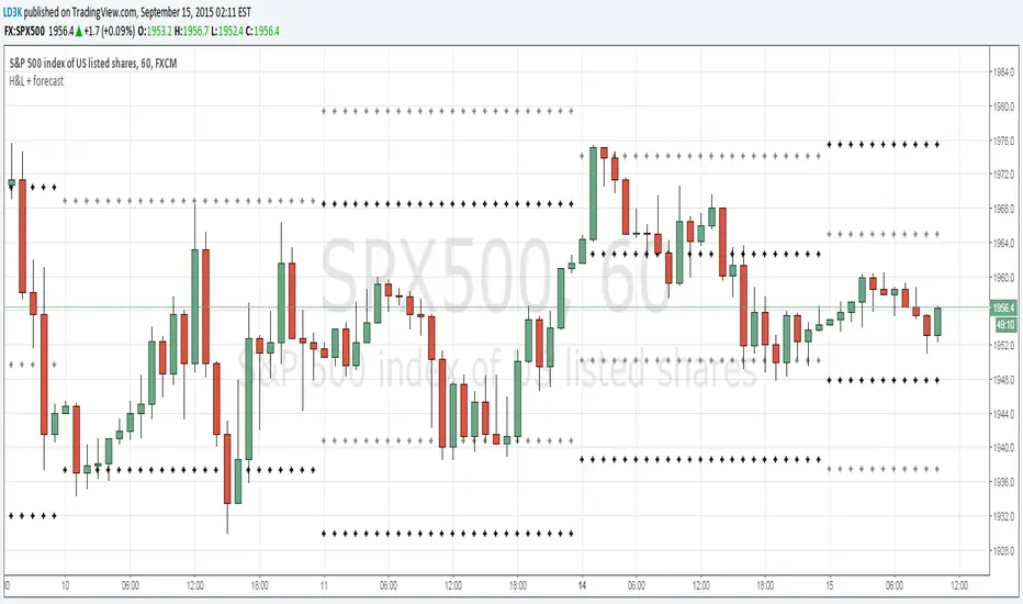
Previous H/Ls and Forecast H/LPlots the previous periods High and Lows (black crosses) and forecasts the next day's High and Lows (gray crosses)

High and LowsSimple script used to show the previous day/week/month high and low as an overlay on the chart
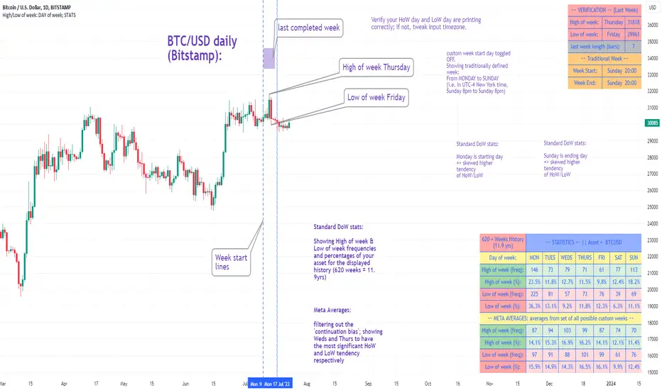
High/Low of week: Stats & Day of Week tendencies// Purpose:
-To show High of Week (HoW) day and Low of week (LoW) day frequencies/percentages for an asset.
-To further analyze Day of Week (DoW) tendencies based on averaged data from all various custom weeks. Giving a more reliable measure of DoW tendencies ('Meta Averages').
-To backtest day-of-week tendencies: across all asset history or across custom user input periods (i.e. consolidation vs trending periods).
-Education: to see how how data from a 'hard-defined-week' may be misleading when seeking statistical evidence of DoW tendencies.
// Notes & Tips:
-Only designed for use on DAILY timeframe.
-Verification table is to make sure HoW / LoW DAY (referencing previous finished week) is printing correctly and therefore the stats table is populating correctly.
-Generally, leaving Timezone input set to "America/New_York" is best, regardless of your asset or your chart timezone. But if misaligned by 1 day =>> tweak this timezone input to correct
-If you want to use manual backtesting period (e.g. for testing consolidation periods vs trending periods): toggle these settings on, then click the indicator display line three dots >> 'Reset Points' to quickly set start & end dates.
// On custom week start days:
-For assets like BTC which trade 7 days a week, this is quite simple. Pick custom start day, use verification table to check all is well. See the start week day & time in said verification table.
-For traditional assets like S&P which trade only 5 days a week and suffer from occasional Holidays, this is a bit more complicated. If the custom start day input is a bank holiday, its custom 'week' will be discounted from the data set. E.g.1: if you choose 'use custom start day' and set it to Monday, then bank holiday Monday weeks will be discounted from the data set. E.g.2: If you choose 'use custom start day' and set it to Thursday, then the Holiday Thursday custom week (e.g Thanksgiving Thursday >> following Weds) would be discounted from the data set.
// On 'Meta Averages':
-The idea is to try and mitigate out the 'continuation bias' that comes from having a fixed week start/end time: i.e. sometimes a market is trending through the week start/end time, so the start/end day stats are over-weighted if one is trying to tease out typical weekly profile tendencies or typical DoW tendencies. You'll notice this if you compare the stats with various custom start days ('bookend' start/end days are always more heavily weighted). I wanted to try to mitigate out this 'bias' by cycling through all the possible new week start/end days and taking an average of the results. i.e. on BTC/USD the 'meta average' for Tuesday would be the average of the Tuesday HoW frequencies from the set of all 7 possible custom weeks(Mon-Sun, Tues-Mon, Weds-Tues, etc etc).
// User Inputs:
~Week Start:
-use custom week start day (default toggled OFF); Choose custom week start day
-show Meta Averages (default toggled ON)
~Verification Table:
-show table, show new week lines, number of new week lines to show
-table formatting options (position, color, size)
-timezone (only for tweaking if printed DoW is misaligned by 1 day)
~Statistics Table:
-show table, table formatting options (position, color, size)
~Manual Backtesting:
-Use start date (default toggled OFF), choose start date, choose vline color
-Use end date (defautl toggled OFF), choose end date, choose vline color
// Demo charts:
NQ1! (Nasdaq), Full History, Traditional week (Mon>>Friday) stats. And Meta Averages. Annotations in purple:
NQ1! (Nasdaq), Full History, Custom week (custom start day = Wednesday). And Meta Averages. Annotations in purple:
Candle Range % MarkerHigh/Low Percentage marker. For a Green Candle its low to High. For a Red its from High to Low of the Candle

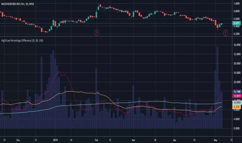
High/Low Percentage DifferenceThis chart shows simple moving averages of the differences in the high and low prices across the time frame you choose.
I use this when researching to see if the investment vehicle meets my criteria for volatility within the time-frame I want to invest.
The columns show the percentage difference between the current candle's high and low.
The lines show the SMA of the past 10(red), 30(orange), and 100(blue) candles, but you can edit these to be whatever you'd like.
High/Low last 1-3 candlesHere you can display the high and low of the last 1, 2 or 3 candles. The whole thing is updated with every new candle. you can also switch the lines on or off as you wish and adjust the colour of the lines. have fun with it
High Low Lines (500 candle 5min)This TradingView script is designed to visualize the highest high and the lowest low from the previous 576 candles on the chart. It draws horizontal lines representing these values and updates them at a specific time each day.

High - Low Difference (Forex)This script is created to read and label the difference between High and Low of a candle in points term & in percentage term.
This is basically made for Forex Trading.
Do explore the settings of the scrip.

High - Low DifferenceThis script is created to read and label the difference between High and Low of a candle in percentage term.
